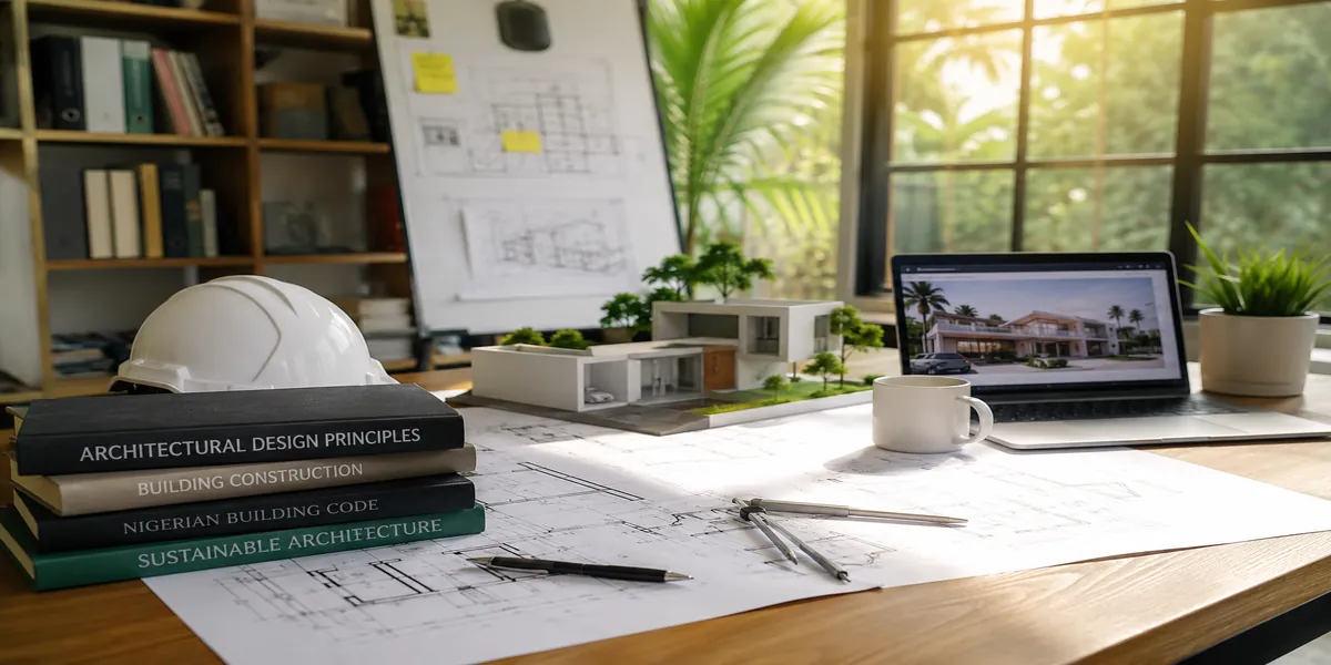
Architectural Design Principles Every Architect and Homeowner Should Know
Architectural Design Principles Every Architect and Homeowner Should Know: Most articles on architectural design principles are written for architecture students preparing for an exam, not for the person actually about to build a house. In my years designing and supervising residential projects across Akwa Ibom and Rivers States, I’ve noticed the same principles architects study in school are the exact same things clients feel instinctively when they walk into a finished building and say “something about this just feels right” they just never had the words for it. This guide gives you both: the principles, and what they actually mean whether you’re the one designing or the one living in it.
Quick Answer: Architectural design principles are the foundational rules that make a building both work and feel right balance, proportion, rhythm, hierarchy, emphasis, contrast, unity, and context, all built on top of the three oldest goals in architecture: firmness, commodity, and delight. Mastering them is what separates an intentional design from a building that just happens to have walls and a roof.
What’s in This Guide
- The three foundations every building is judged on
- The core visual principles, explained with real proportion maths
- What each principle actually means if you’re the homeowner, not the architect
- Context and climate the principle most guides skip entirely
- A real-life example
- Common mistakes
- FAQs
The Three Foundations Every Building Is Judged On
Long before “balance” and “rhythm” became design-school vocabulary, the Roman architect Vitruvius set out three goals every building must achieve, and they still hold up perfectly today:
Firmness (firmitas): the building must stand safely, structurally sound against the loads and conditions it will face
Commodity (utilitas): the building must actually work for the people using it, functionally
Delight (venustas): the building must be a pleasure to look at and to be in
Every principle in this guide is really just a more detailed tool for achieving one of these three. If you remember nothing else, remember this: a design that ignores any one of the three isn’t a complete design, no matter how good it looks on the other two.
The Core Visual Principles, Explained With Real Proportion Maths
Balance
The even distribution of visual weight across a design, so nothing feels like it’s about to tip over. Symmetrical balance mirrors elements on either side of a central axis; asymmetrical balance achieves the same stability using different elements of different sizes, arranged so their visual “weight” still evens out.
Proportion and scale
This is where most guides just say “use the golden ratio” without showing you what that means. The golden ratio, roughly 1:1.618, is a proportion where a smaller part relates to a larger part the same way that larger part relates to the whole. In practice: if a window is 1 metre wide, a golden-ratio-proportioned wall panel around it would be roughly 1.6 metres wide, and the two together would relate to the next larger element in that same 1:1.618 relationship. You don’t need to calculate this on every wall but understanding the ratio helps you spot, by eye, when a window looks “too small” for the wall it’s punched into, which is a proportion problem, not a taste problem.
Rhythm
Created through the repeated placement of elements columns, windows, materials at regular intervals. A row of evenly spaced windows on a façade creates rhythm the same way a repeated beat does in music; break the rhythm without a clear reason, and the eye immediately notices something is “off,” even if the viewer can’t say why.
Hierarchy and emphasis
Not every element in a building deserves equal visual weight. Hierarchy means giving the most important element a main entrance, a feature staircase more visual presence than supporting elements, so a visitor’s eye and feet naturally go where they should.
Contrast
The deliberate use of difference in material, colour, texture, or form to make specific elements stand out against their surroundings, drawing attention exactly where the designer wants it.
Unity/harmony
While contrast creates focus, unity holds the whole design together. A material palette, a colour scheme, or a consistent architectural language across all elevations keeps a building from feeling like several unrelated buildings stitched together.
Movement
The sense of visual flow that guides a person’s eye and often their feet through a space, created by the sequencing of elements like circulation paths, sightlines, and the sequence of rooms opening off each other.
What Each Principle Actually Means If You’re the Homeowner, Not the Architect
This is the part most guides skip, because they’re written for the person drawing the plan, not the person who will live in the finished building:
Balance shows up as: does one side of the house feel heavier or busier than the other when you stand at the entrance?
Proportion shows up as: do the windows look right for the size of the wall, or does something feel “off” without you knowing why?
Rhythm shows up as: do repeated elements windows, columns, roof beams feel intentional, or randomly placed?
Hierarchy shows up as: when you walk in, does your eye know immediately where the main entrance or the most important room is?
Contrast shows up as: is there one feature a material, a colour, a textured wall that gives the building a personality, rather than everything looking the same?
Unity shows up as: does the whole building feel like one coherent design, or like the front and back were designed by two different people?
Movement shows up as: does walking through the house feel natural, or do you keep hitting dead ends and awkward turns?
If you’re commissioning a design and can’t answer these questions confidently by looking at the drawings, that’s exactly the right moment to ask your architect to walk you through it before construction, not after.
Context and Climate The Principle Most Guides Skip Entirely
Nearly every article on this topic treats “context” as a footnote about matching neighbouring buildings. In practice, especially in a tropical climate, context is one of the most consequential principles of all, and it directly affects the other principles too:
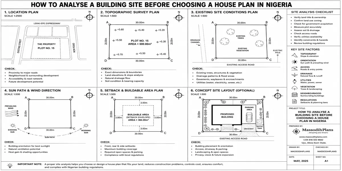
Sun path and orientation. Positioning the building’s long façade away from direct east-west sun exposure reduces heat gain and cooling costs, which also affects where windows a proportion and rhythm decision should actually go.
Prevailing wind direction. Openings positioned to catch cross-ventilation aren’t just a comfort choice; they change where doors and windows sit, which then feeds directly back into the balance and rhythm of the façade.
Local material and cultural context. A design principle applied with imported materials that don’t suit local humidity, or a form that ignores how the surrounding buildings and street actually function, technically satisfies “unity” on paper while failing “commodity” in real life.
In other words: context isn’t a principle you apply after the aesthetic ones in a tropical setting, it’s often the principle that should come first, because it quietly reshapes every other decision that follows it.
A Real-Life Example
On a residential project in Uyo, the client initially wanted a fully symmetrical front façade with matching windows on both sides, purely for balance. Following the sun path, we found the east-facing side would have taken direct morning heat straight into the main bedroom if we kept the window sizes identical. We kept the visual balance by mirroring the window positions, but resized the east-facing openings slightly and added a shading element the façade still read as balanced and rhythmic, but the room performed completely differently in practice. The principle was honoured; the client’s comfort was what actually improved.
Common Mistakes
Applying visual principles like balance and rhythm without checking they still work with the sun path and wind direction for that specific plot.
Chasing symmetry so strictly that function suffers a “balanced” façade that puts a window exactly where you don’t want direct heat or noise.
Ignoring hierarchy, so a visitor genuinely can’t tell where the main entrance is meant to be.
Treating “context” as only about matching neighbouring buildings, and ignoring climate and material context entirely.
Focusing entirely on delight (how it looks) while treating firmness and commodity as someone else’s problem to solve later.
Frequently Asked Questions
Q: What are the three original goals of architecture?
Firmness (structural safety), commodity (function), and delight (aesthetic pleasure) first defined by the Roman architect Vitruvius, and still the foundation every other design principle serves.
Q: Do I need to calculate the golden ratio for every part of my house?
No. Understanding the 1:1.618 relationship helps you recognise, by eye, when a proportion feels wrong you don’t need to calculate it for every wall and window to benefit from knowing it.
Q: Why does climate count as a design principle and not just a technical requirement?
In a tropical climate, the sun’s path and wind direction directly shape decisions that many people consider purely aesthetic, such as window placement. Those choices also influence balance, rhythm, and proportion throughout the design.
Q: How can I tell if a design has good hierarchy?
Stand at the main entrance in the drawings or renders and notice where your eyes go first. If the design naturally draws your attention to the main focal point without signs or arrows, it has a strong visual hierarchy.
Q: Can a building be beautiful but still fail as good architecture?
Yes, if it ignores structural safety or genuine functionality, it fails two of the three original goals of architecture no matter how visually striking it is.
Finally
These principles aren’t decoration rules reserved for architecture school they’re the reason some buildings feel effortless to live in and others never quite settle right, even when you can’t say exactly why. Whether you’re the one designing or the one about to commission a design, asking how balance, hierarchy, and context show up in your specific plan is one of the most useful conversations you can have with your architect before construction begins.
If you are currently planning a building and want these principles applied properly from the first sketch, you can explore our full plans library for ready designs, or check our design services if you need something custom-drawn around your plot’s orientation and climate. If you’re new to reading drawings altogether, our Plan School section breaks things down for beginners. And if this is your first time here, feel free to look around the homepage for more practical guides like this one.
Drop your questions in the comments if a principle in your own design still feels unclear I read every one, and I’d genuinely love to help you see it before you break ground. Design-excellence.
Read the following articles to complete the above lesson:
- Building Design Guide for Safety, Functional, and Cost-Effective Buildings
- House Interior Design Ideas for Every Room, Style and Budget
- Architectural Drawings Guide: Types, Symbols, Standards, Dimensions and Examples
- Building Drawings Explained: Types, Symbols and Real Construction Examples
- Cost of Building a Modern Bungalow in Calabar (Updated Guide)
- House Plans for Sloping Land in Jos, Plateau State, Nigeria: Smart Nigerian Designs
- Best Roofing Options for Houses in Gusau city of Zamfara State, Nigeria: Prices and Durability
- Master Plan vs Site Plan: Key Differences Every Property Owner Must Know
- Estate Layout Plan Explained for Property Developers and Landowners: Complete Guide
- Best Small Plot House Designs for Modern Urban Living
- Building Approval in Nigeria: Costs, Requirements, Process and How to Get Your House Plan Approved Fast
- Bungalow vs Duplex: Which is Better to build in Nigeria Today?
- Cost of Building a 4 Bedroom Duplex in Lagos (Complete Guide)
- Best Roofing Sheets for Nigerian Weather: Complete Guide
- How to Practically Draw and Design a Duplex for Small Plots