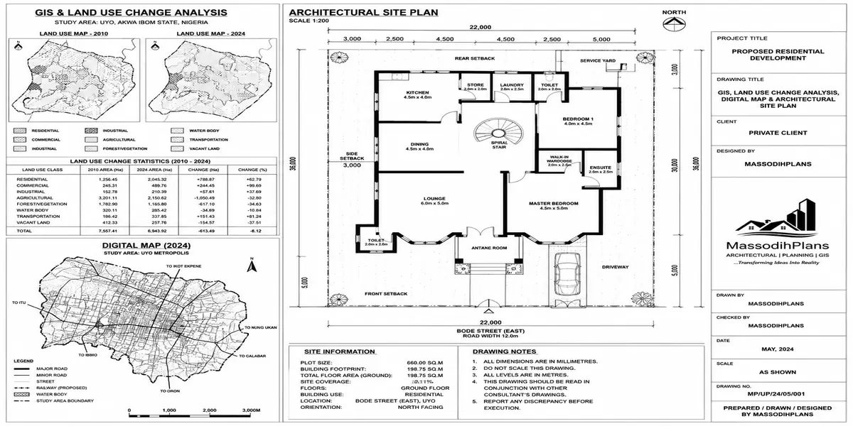
GIS, Land Use Change Analysis and Digital Mapping for Planning and Growth
Here’s a scenario I’ve sat through more times than I can count. A client sometimes a private developer, sometimes a state agency, once even a church board looking to buy land for a campus comes in with a beautiful, colourful land-use map someone produced for them. Green patches for vegetation, grey for built-up, blue for water. They paid good money for it. And then they ask me the only question that actually matters: “So… what do I do with this?”
Nobody had answered that for them. The map existed. The decision didn’t.
That gap between producing a map and actually using it to decide something is what almost every article on GIS and land use change gets wrong, and it’s what this one is built to fix. I’m going to take you through the whole chain: what GIS actually is, how the different map types work, how land use change is technically detected using satellite imagery, and then the part almost nobody writes how you turn that analysis into an actual answer for a developer, a planner, or a community trying to grow responsibly.
GIS Fundamentals: What You’re Actually Working With
What GIS Is, In Plain Terms
A Geographic Information System (GIS) is software that lets you store, analyze, and display information tied to a specific location on earth. The word that matters most in that sentence is “tied” every piece of data in a GIS has a location attached to it, which is what separates it from an ordinary spreadsheet or database. A GIS doesn’t just tell you “there are 4,000 households in this ward” it tells you exactly where each of those households sits, and lets you ask spatial questions like “which households are within 500 metres of a functioning drainage channel?”
Spatial Data: The Two Families
Everything in GIS ultimately comes down to two kinds of data, and understanding the difference will save you from a lot of confusion later.
Vector data represents the world as discrete shapes points, lines, and polygons. A borehole is a point. A road is a line. A plot boundary or a local government area is a polygon. Vector data is precise and good for representing distinct features with clear edges property boundaries, road networks, administrative boundaries.
Raster data represents the world as a grid of cells (pixels), where each cell holds a value. Satellite imagery is raster data every pixel has a value representing reflected light in a particular band. Elevation models, temperature surfaces, and rainfall surfaces are also raster. Raster data is good for representing continuous phenomena that don’t have hard edges elevation, vegetation density, temperature.
The practical takeaway: land use change analysis is fundamentally a raster problem (you’re working with satellite images), while a lot of the planning data you’ll overlay on top of it plot boundaries, roads, drainage lines is vector data. Good GIS work moves fluently between both.
Coordinate Systems: The Part Everyone Skips and Regrets
A coordinate system defines how locations on the curved surface of the earth get translated into flat map coordinates. This sounds like a technical footnote until you’ve had two datasets refuse to line up on screen because one was in WGS84 and the other in a local projected system and you’ve spent an afternoon figuring out why your road network is floating 200 metres away from where it should be.
For Nigeria specifically, you’ll commonly encounter WGS84 (the global GPS standard, in latitude/longitude) and the Nigeria/Minna datum-based projected systems used in older survey records and cadastral work. Knowing which one your data is in and reprojecting everything to a common system before you start analysis is not optional housekeeping. It’s the difference between an analysis that’s usable and one that’s quietly wrong.
Georeferencing
Georeferencing is the process of taking an image or dataset with no inherent location information a scanned paper survey plan, an old aerial photo, a hand-drawn layout and assigning it real-world coordinates so it lines up correctly with everything else in your GIS. This is the unglamorous but essential step that lets you bring historical records, old layout plans, and scanned documents into a modern spatial analysis instead of discarding them.
Spatial Databases
As a project grows past a handful of shapefiles on someone’s desktop, you need a spatial database a structured system (like PostGIS, or a well-organized geodatabase) that stores spatial data alongside its attributes and lets multiple people query and update it without corrupting each other’s work. For a one-off analysis, a folder of files is fine. For an ongoing planning department or a growth-monitoring program that gets updated every year, a proper spatial database is the difference between a system that scales and one that collapses into “which version of this file is the current one?”
If you’re just starting out, don’t get intimidated by the software jargon. Get the coordinate system discipline right first reproject everything to one consistent system before you touch analysis. That single habit prevents more downstream errors than any amount of software skill.
Mapping: The Building Blocks of Spatial Understanding
Before you can analyze change, you need to understand the individual map types that get combined to describe a place. Each one answers a slightly different question.
Location maps
Simply show where a place sits relative to its surroundings the basic “you are here” layer that anchors every other map.
Land-use maps
Show what human activity is happening on the land residential, commercial, agricultural, institutional, recreational. This is about function and human designation.
Land-cover maps
Show what physically covers the ground’s surface vegetation, bare soil, water, built structures, pavement. This is about physical material, not human intent, and it’s the layer satellite classification produces most directly.
The distinction between land-use and land-cover trips a lot of people up, so here’s the shortcut: land cover is what a satellite sees; land use is what people are doing there. A parking lot and a flat concrete rooftop can have identical land cover (impervious surface) but completely different land use.
Road maps
Show the transport network critical for understanding accessibility, connectivity, and where new development is likely to follow existing or planned routes.
Drainage maps
Show natural and constructed water flow paths streams, channels, culverts, floodplains. In a Nigerian context, this is arguably the single most safety-critical map layer, because so much avoidable flood damage comes from development that ignored where water actually wants to go.
Elevation maps
(often as a Digital Elevation Model, or DEM) show the height of the land surface. Combined with drainage data, elevation tells you which areas will flood, which slopes are unstable for construction, and where gravity-fed infrastructure like sewer lines can realistically work.
Population maps
Show where people actually live and at what density essential for sizing infrastructure, schools, and services to actual demand rather than administrative guesswork.
Development maps
Track approved layouts, ongoing construction, and planning applications the layer that shows you where formal growth is happening (or being proposed) as distinct from informal, unplanned expansion.
Infrastructure maps
Show existing roads, power lines, water supply networks, and drainage infrastructure the layer you overlay against population and development maps to find gaps between where people are and where services actually reach.
None of these maps means much alone. Their real power comes from overlaying them putting population density against infrastructure reach, or drainage paths against development maps which is where GIS moves from “pretty picture” to genuine decision-support tool.
Land Use Change Analysis: The Actual Workflow
This is the technical heart of the discipline, and I want to walk through it as a sequence, because each step depends on the one before it, and skipping or rushing any single stage is where most land-use-change studies quietly fall apart.
Step 1: Image Acquisition
You start by acquiring satellite imagery for your area of interest, at two or more points in time say, 2005, 2015, and 2025 so you can measure change across a real time span. Choice of satellite source matters here (more on Landsat and Sentinel below), and so does choosing images from a similar season each year, since vegetation looks very different in the dry season versus the rainy season, and comparing mismatched seasons can create false “changes” that are really just seasonal variation.
Step 2: Preprocessing
Raw satellite imagery needs cleaning before it’s analysis-ready. This includes atmospheric correction (removing haze and atmospheric distortion so pixel values reflect the ground, not the atmosphere), cloud masking (removing or flagging cloud-covered pixels, a real headache in Nigeria’s frequently cloudy wet season), and geometric correction (making sure the image aligns precisely with real-world coordinates). Skip this step, or do it carelessly, and every later stage inherits the error.
Step 3: Classification
This is where raw pixel values get converted into meaningful categories built-up, vegetation, water, bare soil, agriculture. Classification can be done through supervised or unsupervised methods (explained in the technical methods section below), and the choice of classes and classification method should match what question you’re actually trying to answer a study focused purely on urban expansion needs a different class scheme than one studying agricultural land conversion.
Step 4: Validation
A classified map is a hypothesis, not a fact, until it’s checked against reality. Validation means comparing a sample of classified pixels against known ground truth either from field visits, high-resolution reference imagery, or historical records to measure how accurate the classification actually is. Skipping validation is the single most common shortcut that turns an impressive-looking map into a misleading one.
Step 5: Change Detection
Once you have validated classified maps for two or more time periods, you compare them to identify what changed — which pixels moved from vegetation to built-up, from agriculture to bare soil, from water to built-up land reclaimed at a river edge. This is typically done through post-classification comparison or a change matrix, both covered below.
Step 6: Interpretation
Numbers and change maps alone don’t tell a story. Interpretation means asking why the change happened, where it’s concentrated, whether it’s following expected growth corridors or jumping unexpectedly into vulnerable areas, and what pattern it fits organic expansion along a road, leapfrog development skipping past cheaper land into a specific pocket, or informal settlement growth in a floodplain.
Step 7: Planning Recommendation
This is the step that almost never makes it into academic papers or vendor reports, and it’s the step this whole guide is built around. A land use change study that ends at “here’s what changed” has done half the job. The other half — translating that change pattern into a specific, actionable recommendation for where development should be guided, restricted, or serviced is what actually helps a planner or developer make a decision. We’ll go deep into this in the differentiator section below.
Never accept a land-use-change study, from any consultant or platform, that doesn’t state its accuracy assessment results. A map with no reported accuracy figure is a map you should not base a real investment or planning decision on, no matter how professional it looks.
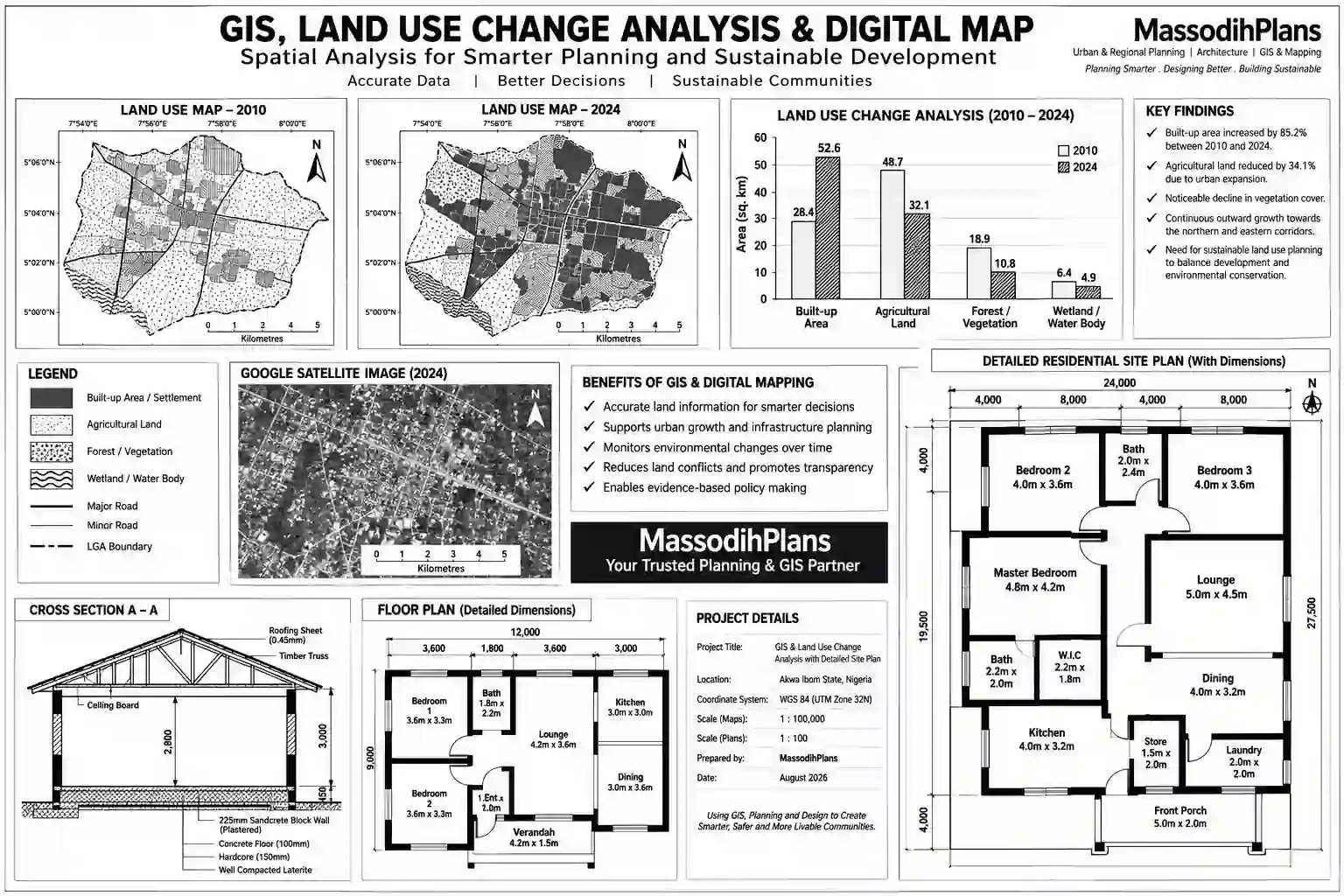
GIS and google earth-based land use analysis guides and services
The Specific Changes You’re Usually Tracking
Built-Up Expansion
The growth of constructed surfaces buildings, roads, pavement at the expense of other land cover types. This is usually the headline metric in growth studies, and it’s the most direct indicator of where a city or town is physically expanding.
Vegetation Loss
The decline in green cover forest, farmland, natural bush often a direct consequence of built-up expansion, but also driven by logging, fuelwood extraction, and agricultural clearing independent of urban growth.
Agricultural Conversion
Farmland being converted to residential, commercial, or industrial use. This matters not just environmentally but economically it’s a direct signal of food production capacity being traded for urban land, often without anyone deliberately deciding that trade-off should happen at the pace it’s happening.
Water-Body Changes
Rivers, lakes, and wetlands shrinking, expanding, or shifting sometimes from natural processes, but frequently from human activity: sand-filling wetlands for development, sedimentation from upstream erosion, or reclamation projects. Tracking this over time flags areas where development is encroaching on natural water systems, which is directly linked to flooding risk downstream.
Urban Sprawl
The spread of low-density, often unplanned development outward from a city’s core, typically outpacing the infrastructure needed to support it. Sprawl is visible in change detection as scattered, fragmented built-up growth rather than compact, contiguous expansion a pattern that’s easy to spot once you’re looking at classified maps across time.
Road Expansion
New and upgraded road networks, both a driver and a consequence of the other changes above new roads open up land for development, and development pressure drives demand for new roads. Tracking road network growth alongside built-up expansion often reveals which came first in a given corridor, which matters for understanding whether infrastructure led growth or growth outpaced infrastructure.
Technical Methods: How the Analysis Actually Gets Done
Satellite Data Sources: Landsat and Sentinel
Landsat, operated by NASA/USGS, has the longest continuous archive of freely available satellite imagery, going back to the 1970s — which makes it the go-to source when you need to study change over several decades. Its moderate resolution (around 30 metres per pixel for most bands) is sufficient for regional and city-scale land use studies.
Sentinel, operated by the European Space Agency’s Copernicus program, offers higher resolution (10 metres for key bands) and more frequent revisits, making it well suited to more recent, finer-grained studies, though its archive doesn’t stretch back as far as Landsat’s.
For a long-term change study say, tracking a city’s growth from 2000 to 2025 Landsat is usually the practical choice because of its archive depth. For a recent, detailed snapshot of current land cover, Sentinel’s finer resolution often gives better results.
Remote Sensing as the Data-Collection Layer
Remote sensing is simply the practice of gathering information about the earth’s surface without physically touching it using sensors on satellites or aircraft to record reflected or emitted energy. It’s the data-collection layer that feeds everything else in this workflow; GIS is where that data gets stored, analyzed, and turned into decisions.
Supervised vs. Unsupervised Classification
Supervised classification requires the analyst to identify sample areas of known land cover types (training samples) “this patch is definitely built-up, this one is definitely water” and the software then learns to classify the rest of the image based on those examples. It generally produces more accurate, purpose-specific results, but it needs the analyst to have real local knowledge of the study area.
Unsupervised classification lets the software group pixels into clusters based purely on spectral similarity, without any predefined training samples, and the analyst assigns meaning to each cluster afterward. It’s faster and requires less upfront local knowledge, but the resulting classes sometimes need manual reinterpretation and don’t always map cleanly onto the categories you actually care about.
For most planning-focused land use change studies, supervised classification, done by someone with genuine familiarity with the study area, produces more usable results.
Spectral Indices: NDVI, NDBI, NDWI
These indices are simple mathematical combinations of specific satellite bands that highlight a particular land cover type, and they’re widely used because they turn a complex, multi-band image into a single, interpretable number per pixel.
NDVI (Normalized Difference Vegetation Index) highlights vegetation health and density higher values indicate denser, healthier vegetation, lower or negative values indicate bare soil, water, or built-up surfaces.
NDBI (Normalized Difference Built-up Index) highlights built-up, impervious surfaces positive values generally indicate urban or built-up land, while negative values point to vegetation or water.
NDWI (Normalized Difference Water Index) highlights the presence of water bodies, useful for tracking water-body changes over time, including wetland loss or river-course shifts.
Using these three indices together, rather than relying on any single one, gives a much clearer picture, because a pixel that scores ambiguously on one index often resolves clearly when checked against the others.
Change Matrices and Post-Classification Comparison
A change matrix (also called a cross-tabulation matrix) is a table showing exactly how much area moved from each land cover class in the earlier period to each class in the later period for example, how many hectares of agricultural land in 2010 became built-up land by 2025. This is the single most useful output for a planner, because it quantifies the actual conversion pathways, not just the net change.
Post-classification comparison is the underlying method that produces this matrix classifying each time period’s image independently, then comparing the resulting maps pixel by pixel. It’s the most widely used change detection approach precisely because it produces this detailed “from-to” change matrix, rather than just showing that change happened somewhere.
Accuracy Assessment
No classification is perfect, and accuracy assessment is the process of measuring how good it actually is typically by comparing a sample of classified pixels against verified ground truth data and calculating metrics like overall accuracy and the kappa coefficient (a statistic that accounts for the possibility of correct classification happening by chance). A study reporting 85%+ overall accuracy with a strong kappa value is one you can reasonably trust for planning decisions; anything lower deserves real scrutiny before you act on it.
From Map to Decision: What GIS Analysis Actually Tells a Developer or Planner
This is the section I actually care most about writing, because it’s the one missing from almost everything published on this topic. A land use change study that stops at “here’s a map of what changed” has done the easy half of the job. Here’s what the same analysis should be able to tell you, in direct answers.
Where Should Development Occur?
Overlay elevation, drainage, existing infrastructure reach, and current land use together, and you can identify areas that are: physically stable (not on steep slopes or unstable soil), outside floodplains and drainage easements, within reasonable distance of existing or planned infrastructure, and not currently high-value agricultural or ecologically sensitive land. Where all of these conditions align, you have a genuine “green light” zone not just land that happens to be available, but land that makes physical, infrastructural, and environmental sense to build on.
Where Should Development Be Avoided?
The inverse overlay flags the “red zones”: floodplains and active drainage paths, steep or unstable slopes, wetlands and their buffer zones, and land already committed to critical agricultural production your local food supply depends on. A land use change study that shows built-up growth already creeping into these zones is showing you a problem in progress, not a hypothetical risk which is exactly the evidence a planning authority needs to justify enforcement or a stronger buffer policy.
Where Is Urban Expansion Occurring?
This comes directly out of the change matrix and change detection maps the specific corridors and pockets where built-up land cover has grown fastest between your study periods. What matters beyond the raw location is the pattern: is growth contiguous and following planned infrastructure (a healthy pattern), or fragmented and scattered (a sprawl pattern that will be expensive to service later)?
Which Areas Are Becoming Environmentally Vulnerable?
Cross-reference vegetation loss, water-body shrinkage, and built-up expansion against drainage and elevation data. Areas showing rapid vegetation loss combined with increasing impervious surface on low-lying, poorly drained land are the areas where flood risk is actively increasing year over year not a future possibility, but a trend already visible in the data if you know how to read the change matrix correctly.
Where Are the Infrastructure Gaps?
Overlay population density and current development maps against existing road, drainage, power, and water infrastructure. The gap population and development present, infrastructure absent or thin is exactly where service delivery is failing today and where new infrastructure investment would have the highest impact per naira spent, rather than being spread evenly across an area regardless of actual need.
How Has Land Use Changed Over Time?
This is the summary question the whole workflow builds toward, and the honest answer is always a change matrix, not a single map a quantified account of exactly how many hectares moved from agriculture to built-up, from vegetation to bare soil, from water body to reclaimed land, across your study period. That quantified account, not a pretty colour-coded picture, is what should sit in front of a planning committee or investment decision-maker.
If a GIS report you’ve commissioned or been handed doesn’t answer at least three or four of the six questions above in plain language, ask for that translation explicitly before you act on it. The maps and statistics are the evidence; the answers to these questions are the actual decision-support you’re paying for.
Combining vegetation and built-up indices gives a more dynamic and accurate view of land use and land cover change than relying on either measure alone. That combined view read together with drainage, elevation, and infrastructure data is what turns a technically sound classification into something a developer or planning authority can actually act on.
Frequently Asked Questions
What’s the real difference between land use and land cover?
Land cover is the physical material covering the ground vegetation, water, built structures as seen by a satellite. Land use is the human activity or designation attached to that land residential, agricultural, institutional which sometimes can’t be told apart from land cover alone and needs local knowledge or ground data to confirm.
How far back can land use change analysis go?
With Landsat imagery, reliably back to the early-to-mid 1970s for many areas, though image quality and availability improve significantly from the 1980s onward. For most practical planning studies, a 15-to-25-year window gives a clear, actionable growth trend without needing the earliest, lower-quality archive imagery.
How accurate does a land use classification need to be to trust it?
Above roughly 85% overall accuracy with a reasonably strong kappa coefficient is generally considered reliable for planning purposes. Below that, treat the results as indicative rather than decision-grade, and ask for the specific accuracy figures before relying on any study.
Can GIS analysis actually predict where flooding will get worse?
It can identify where the risk is increasing, by combining vegetation loss, built-up expansion, and drainage/elevation data showing you where impervious surface is growing fastest on poorly drained, low-lying land. It’s a strong early-warning tool rather than a precise flood forecast, and it’s most valuable when it changes a planning decision before the flooding happens, not after.
Do I need expensive software to do this kind of analysis?
Not necessarily. Free tools like QGIS and Google Earth Engine can handle the full workflow described here image acquisition, classification, change detection, and accuracy assessment at a fraction of the cost of commercial software, though they do demand more hands-on technical skill.
Finally
A land use change study is only as valuable as the decision it changes. Everything covered here the fundamentals, the mapping layers, the classification and change detection workflow, the technical methods exists to serve one outcome: a planner or developer looking at a piece of land and knowing, with real evidence behind it, whether to build there, avoid it, or invest in the infrastructure that would make it viable. If your GIS work stops at a colourful map with no answer to that question, it hasn’t actually done its job yet.
image acquisition → preprocessing → classification → validation → change detection → interpretation → planning recommendation.
Our GIS and Land Use Change Analysis Service: What to Expect
Everything above explains the theory. This section is the practical version what happens when you actually commission this kind of work from us, so you know what you’re paying for and what you’ll walk away with.
What problem does this service solve?
It answers the question every client eventually asks: “Is this land or area actually safe and sensible to build on, invest in, or plan for growth around?” Without this analysis, decisions about land purchase, layout design, or infrastructure investment get made on assumption, hearsay, or how a plot looks on a single site visit none of which tell you how that land has behaved over time, or where it’s genuinely heading.
Who needs it?
Private developers evaluating a large parcel before purchase; estate and layout planners designing new residential schemes; government agencies and community associations monitoring growth or flood risk; NGOs and researchers studying environmental change; and increasingly, diaspora clients buying land remotely who can’t physically inspect it themselves and need an evidence-based second opinion before committing funds.
When should you commission it?
Ideally before you buy the land or commit to a layout at that stage, the analysis can still change your decision. It’s also valuable at the master-planning stage of a large estate, before infrastructure investment decisions are locked in, and periodically afterward (every 3–5 years) for any organization actively monitoring growth or environmental change in an area they’re responsible for. Commissioning it after construction has already started is still useful for understanding risk, but it can no longer change the site decision itself.
What information do we need from the client?
The exact location and boundary of the area of interest (a survey plan, coordinates, or even a clearly marked Google Earth boundary works); the specific decision you’re trying to make (site selection, layout design, flood risk, growth monitoring); the time span you care about, if historical change matters to your question; and any existing data you already have old survey plans, previous studies, or local knowledge about the site’s history that satellite imagery alone won’t reveal.
How the analysis is carried out
We follow the same workflow covered earlier in this guide: acquiring satellite imagery for your area across the relevant time periods, preprocessing it, classifying land cover, validating that classification against ground truth or reference data, running change detection to produce a change matrix, and interpreting the results specifically against your stated decision not just producing a generic report. Where the project needs it, we combine this with drainage, elevation, and existing infrastructure data to answer the “where should you build, where should you avoid” questions directly.
The more specific you are about the actual decision you’re trying to make upfront, the more useful the final deliverable will be. “Analyze this land” produces a generic report; “tell me if this land floods and whether it’s safe for a 20-unit residential layout” produces an answer.
What the client receives
A written report in plain language not just technical jargon covering the land cover classification, the change detection results with a change matrix, the accuracy assessment, and a clear planning recommendation section that directly answers your stated decision. This is accompanied by the actual map outputs (classified maps, change maps, and any relevant overlays) in a format you can share with your team, your bank, or your board.
What decisions the deliverable supports
Whether to purchase a specific piece of land; how to zone or lay out a large parcel to avoid flood-prone or unstable sections; where to prioritize infrastructure investment within a growing area; whether an existing development is at increasing environmental risk and needs mitigation; and, for public agencies, where enforcement or stronger planning controls are actually justified by evidence rather than assumption.
Common mistakes people make
Commissioning this kind of study after land has already been purchased, when it can no longer change the core decision; treating a single point-in-time map as sufficient without understanding the trend behind it; ignoring the accuracy assessment and treating every classified pixel as gospel; and asking for “a map” without stating the actual decision the map needs to support, which produces a technically correct but practically useless report.
What can go wrong if the service is skipped?
Land gets purchased or developed on a floodplain or drainage path that a proper analysis would have flagged clearly. Layouts get designed without accounting for how the surrounding area’s infrastructure gaps will strain a new development. Communities discover, years too late, that vegetation and water-body loss around them has been accelerating a flood risk that could have been identified and planned around from the outset. In almost every case I’ve seen this go wrong, the underlying data existed and was accessible nobody had simply translated it into a decision before ground was broken.
Example
A client came to us with a large parcel outside an expanding town, attracted by the low price relative to nearby, more established plots. The change analysis showed the parcel sat directly along a natural drainage path that had been visibly narrowing over the previous decade as upstream vegetation was cleared a pattern invisible from a single site visit but unmistakable across the multi-year classified imagery. We recommended against building on roughly a third of the parcel and proposed an adjusted layout that kept structures clear of that drainage corridor while still using the rest of the land productively. That third of the parcel would otherwise have been the first section to flood in a heavy rainy season.
Even the best land use change analysis is a decision-support tool, not a guarantee. It tells you what has happened and where the risk patterns point final site-specific decisions should still involve a physical soil test and, where relevant, a licensed surveyor’s confirmation of boundaries and title.
Limitations and professional boundaries
This service assesses land cover, change patterns, and spatial risk indicators it does not replace a soil test, a structural engineer’s foundation design, or legal title verification, all of which remain essential before construction. Satellite-based classification also has inherent resolution limits; very small-scale features (an individual building extension, a narrow drainage channel) may not always be distinguishable at the pixel level, which is why field validation remains part of a properly done study.
Ready to find out what your land is actually telling you?
Why You Shouldn’t Plan Your Next Land Decision Without This
Here’s the truth most people only learn after the damage is done: land doesn’t wait for you to catch up. A plot that was residential-zoned agricultural land five years ago, a floodplain quietly expanding because upstream development changed how water moves, a “safe” investment site actually sitting on a growth corridor about to be reclassified you cannot see any of this by looking at the land. You can only see it through proper GIS analysis, land use change mapping, and digital planning data.
This is exactly the gap I close. Using GIS, land use change analysis, and digital mapping, I show you what a plot has actually been, what it’s becoming, and what that means for your investment, your development, or your community’s growth plan before you commit money you can’t take back.
If you are buying land, planning an estate, advising a community, or managing growth in your local government area, this analysis isn’t something to schedule “someday.” Every month without it is a month you’re deciding blind.
Talk to me before your next land decision, not after it. Visit Services to book a consultation today, or reach out directly I’ll tell you plainly what the data shows, and what it means for you.
Related Guides/services
- How GIS Can Help Identify Flood-Prone Areas Before You Build in Nigeria
- Site Plan Analysis and Layout Planning for Land Development and Building
- Architectural Design and Drafting for House Plans, Building Plans and 3D
- How GIS and Mapping Can Improve Residential Site Planning in Nigeria Today
- How GIS Can Help Identify Flood-Prone Areas Before You Build in Nigeria
- How GIS Can Help You Choose the Right Land for Your Dream House in Nigeria
- GIS Mapping Explained: How Geographic Information Systems Are Changing Urban Planning
- How to Verify Land Ownership Using GIS and Survey Records
- GIS Applications in Urban Planning: Real-World Examples That Work
Author
Massodih Okon is a Nigerian built-environment professional with academic and professional experience in urban and regional planning, geography, architectural design, Landscape Design, GIS and land development.
He holds a Master’s degree in Urban and Regional Planning from the University of Uyo and a first degree in Geography and Regional Planning.
Through MassodihPlans, he publishes practical guides on Nigerian house plans, building design, physical planning, site planning, development approval and residential construction. Read the full author profile →