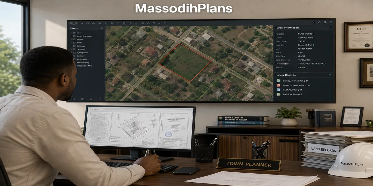
How Do I Use QGIS for Site Planning and Land Analysis
A student sent me a screenshot last year that I still think about. He had digitized a plot boundary in QGIS, and on his map, the plot was sitting confidently in the middle of the Atlantic Ocean several hundred kilometres off the Nigerian coast. His coordinates were correct. His survey beacon values, straight from the surveyor’s table, were correct. What was wrong was a single dropdown setting he didn’t know existed, buried three clicks deep in a dialog box he’d never opened.
That’s the real story of learning QGIS. It’s not a hard software to click through it’s a software where one invisible setting can silently move your entire project into the ocean, and no tutorial ever mentions it because most tutorials are written by people who learned GIS somewhere with tidy, pre-cleaned data and never had to fight a Nigerian survey plan into shape. I have. This guide is written from that fight as someone who uses QGIS for actual site planning and land suitability work, teaches it, and has made most of the mistakes I’m about to warn you against.
How to Use QGIS: Getting Your Bearings Before You Touch a Tool
Before any tutorial makes sense, you need to understand what you’re actually looking at when QGIS opens, because most beginners get lost in the interface before they even reach the analysis.
The Layers Panel (usually left side) is your table of contents every dataset you’ve loaded, stacked in drawing order. Whatever sits on top of the list draws on top of the map, which trips up more beginners than any tool ever will: your plot boundary layer needs to sit above your satellite image layer, or it simply won’t be visible.
The Map Canvas is the main working area where everything actually renders.
The Toolbar holds your most-used tools pan, zoom, identify, and the digitizing tools you’ll use constantly for site planning.
The Browser Panel lets you navigate your computer’s folders and connect to online data sources without leaving QGIS.
The Processing Toolbox (Processing menu, or Ctrl+Alt+T) is where every real analysis tool lives buffer, clip, intersect, slope, viewshed, and hundreds more. This is the panel most beginner tutorials barely touch, and it’s the one that actually does the land analysis work this guide is about.
Before adding a single layer, set your Project CRS deliberately. For site planning work in Nigeria, this usually means a UTM zone matching your location Zone 31N (western Nigeria, including Lagos), Zone 32N (central Nigeria), or Zone 33N (eastern Nigeria, including Akwa Ibom and Rivers). Get this wrong at the start, and every distance and area calculation downstream will be quietly wrong, even when the map looks fine visually.
The Coordinate Problem Nigerian Beginners Actually Face (No Other Tutorial Covers This)
Here is the layer that separates a generic QGIS tutorial from one that actually works for Nigerian site planning, and it’s the exact problem behind the “plot in the ocean” story above.
Most Nigerian survey plans give beacon coordinates as Northing and Easting values referenced to the Minna Datum, often in a Nigerian UTM zone or occasionally in the older Nigeria Belt system (West Belt, Mid Belt, East Belt). QGIS, by default, wants to work in WGS84 (the global GPS standard) unless you explicitly tell it otherwise. If you import Minna-datum survey coordinates into a project set to WGS84 without applying the correct transformation, your plot doesn’t just shift slightly it can shift by anywhere from a few metres to, in some misconfigured cases, an alarming distance, because the two datums don’t share the same origin point.
Here’s the practical fix:
Confirm with your surveyor exactly which datum and zone your beacon coordinates are referenced to don’t assume; ask directly.
In QGIS, when creating a new layer or importing a CSV of coordinates, explicitly set the layer’s CRS to match for Minna Datum data, this is typically listed as “Minna / Nigeria West Belt,” “Minna / UTM zone 31N/32N/33N,” or similar, searchable directly in the CRS selector by typing “Minna.”
Only after the layer’s own CRS is correctly set should you let QGIS reproject it into your project’s working CRS this is where the correct transformation actually happens, rather than QGIS silently assuming your raw numbers are already in the format it expects.
Cross-check by loading a known reference point (a beacon you can also identify on satellite imagery) and confirming it lands where it should before proceeding with the rest of your analysis.
If a QGIS project “looks right” when zoomed in but every measurement plot area, setback distance, boundary length comes out wrong compared to your survey document, a datum or CRS mismatch is almost always the cause. Check this before questioning your data, your tools, or your own math.
QGIS for Beginners: Setting Up Your First Site Planning Project
Once your CRS discipline is in place, here’s the actual beginner workflow, structured the way I’d walk a first-time student through it.
Step 1: Install QGIS Properly
Download the Long Term Release (LTR) version from the official QGIS website rather than the latest version, unless you specifically need a newer feature the LTR is more stable for real project work and has fewer surprise bugs mid-project.
Step 2: Create a New Project and Set Your CRS First
Before adding any data, go to Project CRS and set your working zone as covered above. This one habit prevents most of the downstream errors beginners blame on “QGIS being difficult.”
Step 3: Add a Satellite Basemap for Context
Install the QuickMapServices plugin (Manage and Install Plugins, search “QuickMapServices”), then use it to add a satellite basemap (Google Satellite or Bing Aerial work well for Nigerian coverage). This immediately gives you real-world context roads, existing buildings, vegetation, water bodies around your site, which raw survey data alone never shows you.
Step 4: Add Your Site Data
For site planning specifically, you’re usually bringing in one or more of:
- A shapefile or GeoJSON of your plot boundary (from a surveyor or digitized by you)
- A CSV of beacon coordinates (imported via Layer Add Delimited Text Layer)
- A scanned survey plan or site layout image that needs georeferencing (see below)
Step 5: Georeference a Scanned Plan (If That’s What You Have)
Many Nigerian site plans still exist only as scanned PDFs or images with no embedded coordinates. QGIS’s Georeferencer tool (Georeferencer) lets you pin known points on the scanned image to their real-world coordinates, turning a flat scan into a spatially accurate layer you can measure and analyze. This single tool is the difference between “a pretty picture of a plan” and “usable spatial data” and it’s genuinely one of the most underused features by beginners who don’t realize it exists.
When georeferencing, use at least four widely spaced reference points, not two or three clustered close together this dramatically improves accuracy across the whole plan, not just near your reference points.
How to Make a Map in QGIS: From Raw Data to a Presentable Site Plan
Once your data is loaded and correctly projected, “making a map” is really two separate skills: styling the data well, and laying it out for output.
Styling Your Layers
Double-click any layer to open its Properties, then go to Symbology. For site planning maps specifically:
Give plot boundaries a distinct outline colour with no fill (or a very light, semi-transparent fill) so the satellite imagery beneath remains visible
Use categorized styling (not single symbol) when showing multiple land use types, zones, or plot classifications on the same map this is what turns a flat outline into an actual thematic map
Label features directly on the map (Layer Properties) with plot numbers, areas, or names where relevant, rather than relying purely on a legend
Laying Out the Final Map
The Print Layout ( New Print Layout) is where a working QGIS project becomes a shareable, presentable map. Inside the layout:
Add your map canvas as a frame, then add a North Arrow, Scale Bar, and Legend these three elements are what separate a professional site plan output from a screenshot, and their absence is one of the fastest ways a map loses credibility with a client or approval authority
Add a title block with the site name, date, coordinate system used, and your name or firm a habit borrowed directly from architectural drawing conventions that most GIS-only users skip
Export as PDF for sharing and approval submissions, or as a georeferenced image/DXF (via the Processing Toolbox’s export tools) if the map needs to move into AutoCAD for further architectural or engineering work
A site plan map without a scale bar and stated coordinate system is not a professional document, no matter how good it looks. If you intend to submit any QGIS-produced map as part of a planning or building approval package, confirm your local planning authority’s specific format requirements before finalizing your layout.
How to Perform Analysis in QGIS: Real Land Analysis Workflows for Site Planning
This is the part that actually justifies using QGIS over a plain drawing tool the analysis. Here are the workflows I use most in real site planning and land suitability work, explained in the order you’d typically apply them.
Buffer Analysis for Setback Compliance
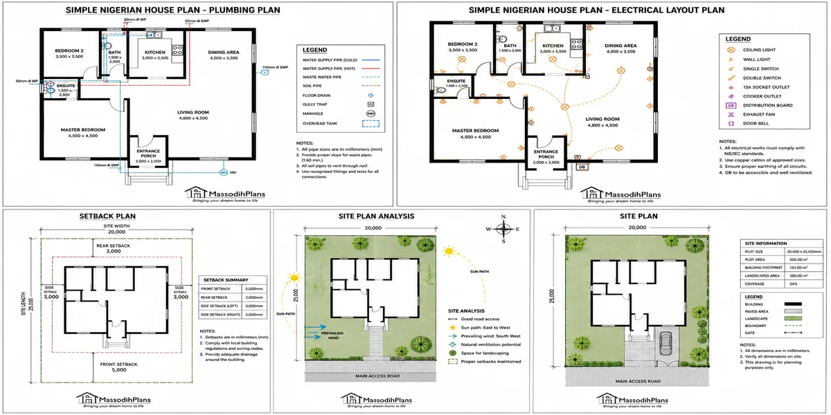
Setbacks the mandatory distance a building must sit from a plot boundary are a perfect QGIS use case. Using Vector Geoprocessing Tools Buffer on your plot boundary with a negative distance (or by buffering the boundary inward), you generate a “buildable envelope” polygon that visually shows exactly where construction is legally permitted, before an architect draws a single wall. This turns an abstract regulatory number into a concrete shape you can design against.
Overlay Analysis for Site Suitability
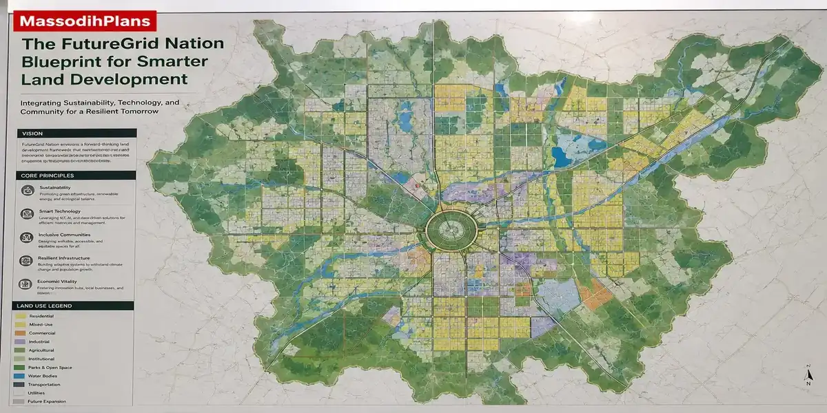
Overlay analysis combines multiple criteria layers to identify where a site is actually suitable for development. A basic but genuinely useful workflow:
Create or obtain layers for your key criteria slope, proximity to existing roads, distance from drainage channels or water bodies, and flood-prone zones
Reclassify each layer into a simple suitability score (using the Raster Calculator for raster data, or attribute-based classification for vector data)
Combine the scored layers using Raster Calculator (for raster overlays) or Union/Intersect tools (for vector overlays) to produce a single composite suitability map
This is the same logic behind formal Multi-Criteria Decision Analysis (MCDA) methods used in professional land suitability studies, simplified into something a single practitioner can run without specialized statistical software.
Slope and Elevation Analysis from Free Elevation Data
Download SRTM (Shuttle Radar Topography Mission) elevation data for your area of interest freely available and easily added via QGIS’s built-in data sources or downloaded directly from USGS EarthExplorer. Once loaded:
Run Raster > Analysis > Slope to generate a slope map, immediately flagging areas too steep for straightforward construction or requiring significant earthworks
Generate contour lines (Raster > Extraction > Contour) from the same elevation data to understand how water will naturally flow across your site critical for drainage design and for spotting flood risk before it becomes an expensive discovery mid-construction
Proximity and Network Analysis
Use the Distance to Nearest Hub or Service Area tools (Processing Toolbox, search “distance” or “service area”) to analyze how far a site sits from existing roads, schools, markets, or drainage infrastructure. For urban development at a neighbourhood or estate scale, this is exactly how you evaluate whether a proposed layout is actually well-connected, rather than just visually appealing on paper.
Flood Risk Screening (A Genuinely Practical Layer Most Tutorials Skip Entirely)
This deserves its own explanation because it’s directly relevant to Nigerian site planning and almost never covered properly online. Using your slope and elevation data:
Identify low-lying areas and natural drainage paths using the contour and slope outputs above
Overlay this against any available flood extent or hazard data for your state (several Nigerian states and NGOs have released flood extent shapefiles through humanitarian data platforms in recent years search the Humanitarian Data Exchange (HDX) for your specific state)
Treat the result as an early-warning screening tool, not a certified flood risk assessment QGIS analysis at this level tells you where to ask harder questions and commission a proper hydrological study, not a final answer on buildability
I run this flood-screening overlay on every coastal or low-lying site before a client commits to a plot, not after. It has, more than once, been the reason a client walked away from a plot that looked perfect on a physical site visit but sat in a natural drainage path that only elevation data revealed clearly.
QGIS Mapping Tutorial: Bringing It Together on a Real Site Planning Project
Here’s how these pieces connect on an actual project, start to finish, the way I’d run it myself:
- Set project CRS to the correct Nigerian UTM zone for the site’s location
- Add a satellite basemap via QuickMapServices for immediate visual context
- Import the plot boundary either from surveyor-supplied coordinates (checked against the correct datum) or by georeferencing a scanned plan
- Buffer the boundary inward to generate the buildable envelope based on local setback requirements
- Download SRTM elevation data for the site and generate slope and contour layers
- Run a basic suitability overlay combining slope, drainage proximity, and any available flood data
- Style everything with clear symbology boundary, buildable envelope, contours, suitability zones
- Build the final layout with north arrow, scale bar, legend, and title block
- Export as PDF for client presentation or approval submission, or as DXF if the architectural design phase needs to pick it up in AutoCAD next
This is the actual bridge between GIS analysis and architectural design that most content treats as two completely separate worlds. On real projects, they’re not separate the QGIS analysis is what tells you where and how a building can legally and practically go, before the architectural drawing phase begins.
Free Data Sources Worth Knowing (Rarely Listed Together Anywhere)
OpenStreetMap roads, buildings, and points of interest, freely accessible and editable, often more current than official government sources for fast-growing Nigerian areas
SRTM / Copernicus DEM free elevation data via USGS EarthExplorer or directly within QGIS’s data source manager
Humanitarian Data Exchange (HDX) flood extents, administrative boundaries, and population data for many Nigerian states, contributed by NGOs and government partners
Sentinel-2 satellite imagery free, reasonably high-resolution imagery via Copernicus Open Access Hub, useful for land cover and vegetation analysis beyond what a basemap alone shows
QuickMapServices plugin basemaps Google Satellite and Bing Aerial for immediate visual context without a separate imagery download
Free data sources are excellent for early-stage screening, feasibility, and suitability analysis but they are not a substitute for a registered surveyor’s beacon coordinates and a properly conducted soil test when you move into actual construction. Use QGIS to ask better questions early; use licensed professional input to make final decisions.
Common QGIS Mistakes I See Repeatedly (Beyond the Datum Problem)
Mixing coordinate systems across layers without reprojecting QGIS will often still display everything in roughly the right place through on-the-fly reprojection, which hides the problem until you try to run a precise measurement or analysis and the numbers don’t add up
Digitizing without snapping enabled (View > Toolbars > Snapping Toolbar) this leaves tiny gaps or overlaps between boundaries that look fine zoomed out but corrupt area and buffer calculations
Running analysis on unprojected (geographic, degree-based) data area and distance tools give nonsense results in a geographic CRS; always reproject to a proper projected CRS (like your UTM zone) before measuring anything
Skipping the attribute table beginners focus entirely on the visual map and ignore the attribute table, where the actual data driving your analysis lives; a suitability map is only as good as the attribute values feeding it
Treating a beautiful map as proof of a sound analysis styling can make weak analysis look convincing; always be able to explain what data and method produced a result, not just show that it looks good
Frequently Asked Questions
Is QGIS good enough for professional site planning, or do I need paid software?
QGIS is genuinely capable of the full site planning and land analysis workflow covered in this guide, and is used professionally worldwide. Paid GIS software (like Esri’s ArcGIS) offers some additional enterprise features and support, but for individual practitioners, students, and most site planning work, QGIS is not a “lesser” tool it’s a complete one.
Can I use QGIS instead of AutoCAD for architectural drawings?
No they solve different problems. QGIS excels at spatial analysis, suitability studies, and working with real-world coordinate data across large areas. AutoCAD (or similar CAD software) is built for precise architectural and structural drawing. The professional workflow uses QGIS for site analysis and exports the result (via DXF) into CAD software for detailed design.
Why does my plot look like it’s in the wrong location in QGIS?
This is almost always a coordinate reference system or datum mismatch very commonly, Minna Datum survey coordinates loaded without the correct CRS applied. Check the coordinate section of this guide before assuming your data itself is wrong.
What file formats does QGIS accept for survey data?
Shapefiles (.shp), GeoJSON, CSV files with coordinate columns, DXF/DWG (with some limitations), and KML are all directly supported, alongside raster formats like GeoTIFF for imagery and elevation data.
Do I need internet access to use QGIS?
Only for pulling in online basemaps, plugins, or downloading fresh datasets. Once data is loaded and saved locally, QGIS runs and analyzes fully offline useful for fieldwork or areas with unreliable connectivity.
How accurate is QGIS flood risk analysis compared to a professional flood study?
QGIS-based screening using elevation and slope data is a genuinely useful early indicator, not a certified assessment. It tells you where to investigate further; a proper hydrological study, done by a qualified specialist, is what you need before any final development decision on flood-sensitive land.
Conclusion
QGIS earns its place in site planning not because it makes pretty maps plenty of tools do that but because it turns scattered survey coordinates, elevation data, and boundary documents into a single spatial workflow that actually answers the question a developer, planner, or student is asking: is this land suitable, where exactly can I build on it, and what does the ground actually do that a flat drawing never shows. Get your coordinate system right at the very start, and the rest of this workflow will genuinely work for you the way it’s meant to.
If you’re working through a real site and want this kind of analysis applied to your specific plot, our Services page outlines how we support planning and site suitability work alongside architectural design. Browse our Plans Library for house and estate designs already developed with proper site analysis behind them, or visit Plan School to build your foundation in reading plans and site documents before your next project. You can also explore more planning and design guides on our Homepage.
- How Do I Use ArcGIS? A Practical Guide for Urban Planning and Site Analysis
- How Do I Use GIS? A Real Guide to Urban Planning, Property and Site Mapping
- How Do I Make a Map? Step-by-Step GIS Mapping for Urban Planning and Design
- Land Suitability Analysis and GIS Site Selection for Development Projects
- GIS, Land Use Change Analysis and Digital Mapping for Planning and Growth
- Where Can I Get GIS Data for Land Use, Property Mapping and Urban Planning?
Author
Massodih Okon is a Nigerian built-environment professional with academic and professional experience in urban and regional planning, geography, architectural design, Landscape Design, GIS and land development.
He holds a Master’s degree in Urban and Regional Planning from the University of Uyo and a first degree in Geography and Regional Planning.
Through MassodihPlans, he publishes practical guides on Nigerian house plans, building design, physical planning, site planning, development approval and residential construction. Read the full author profile →